ShopDreamUp AI ArtDreamUp
Deviation Actions


![[CLOSED] Shinrei No.8](https://images-wixmp-ed30a86b8c4ca887773594c2.wixmp.com/f/c7495cb5-707e-4f78-ab8b-5b236093935c/dalpuv0-3703127e-c9ce-43ec-8967-d611bf9f5bb7.jpg/v1/crop/w_184,h_184,x_0,y_20,scl_0.26285714285714,q_70,strp/_closed__shinrei_no_8_by_zenithomocha_dalpuv0-92s-2x.jpg?token=eyJ0eXAiOiJKV1QiLCJhbGciOiJIUzI1NiJ9.eyJzdWIiOiJ1cm46YXBwOjdlMGQxODg5ODIyNjQzNzNhNWYwZDQxNWVhMGQyNmUwIiwiaXNzIjoidXJuOmFwcDo3ZTBkMTg4OTgyMjY0MzczYTVmMGQ0MTVlYTBkMjZlMCIsIm9iaiI6W1t7ImhlaWdodCI6Ijw9MTAwNiIsInBhdGgiOiJcL2ZcL2M3NDk1Y2I1LTcwN2UtNGY3OC1hYjhiLTViMjM2MDkzOTM1Y1wvZGFscHV2MC0zNzAzMTI3ZS1jOWNlLTQzZWMtODk2Ny1kNjExYmY5ZjViYjcuanBnIiwid2lkdGgiOiI8PTcwMCJ9XV0sImF1ZCI6WyJ1cm46c2VydmljZTppbWFnZS5vcGVyYXRpb25zIl19.Q_ibVVMiIoDqBtnl3DUn-PaaGB7Tj5oIhj4FnbKegbE)
![[CLOSED] Shinrei No.8](https://images-wixmp-ed30a86b8c4ca887773594c2.wixmp.com/f/c7495cb5-707e-4f78-ab8b-5b236093935c/dalpuv0-3703127e-c9ce-43ec-8967-d611bf9f5bb7.jpg/v1/crop/w_92,h_92,x_0,y_10,scl_0.13142857142857,q_70,strp/_closed__shinrei_no_8_by_zenithomocha_dalpuv0-92s.jpg?token=eyJ0eXAiOiJKV1QiLCJhbGciOiJIUzI1NiJ9.eyJzdWIiOiJ1cm46YXBwOjdlMGQxODg5ODIyNjQzNzNhNWYwZDQxNWVhMGQyNmUwIiwiaXNzIjoidXJuOmFwcDo3ZTBkMTg4OTgyMjY0MzczYTVmMGQ0MTVlYTBkMjZlMCIsIm9iaiI6W1t7ImhlaWdodCI6Ijw9MTAwNiIsInBhdGgiOiJcL2ZcL2M3NDk1Y2I1LTcwN2UtNGY3OC1hYjhiLTViMjM2MDkzOTM1Y1wvZGFscHV2MC0zNzAzMTI3ZS1jOWNlLTQzZWMtODk2Ny1kNjExYmY5ZjViYjcuanBnIiwid2lkdGgiOiI8PTcwMCJ9XV0sImF1ZCI6WyJ1cm46c2VydmljZTppbWFnZS5vcGVyYXRpb25zIl19.Q_ibVVMiIoDqBtnl3DUn-PaaGB7Tj5oIhj4FnbKegbE)


![Commission for: Oshiruu[3]](https://images-wixmp-ed30a86b8c4ca887773594c2.wixmp.com/f/40e4d5ae-caef-44e6-a594-eea70ee018e2/d9u6q7d-c6652a7e-564d-43c0-aa53-3ec6ff0ea8a4.png/v1/crop/w_184,h_184,x_36,y_0,scl_0.16384683882458,q_70,strp/commission_for__oshiruu_3__by_xyorutenshi_d9u6q7d-92s-2x.jpg?token=eyJ0eXAiOiJKV1QiLCJhbGciOiJIUzI1NiJ9.eyJzdWIiOiJ1cm46YXBwOjdlMGQxODg5ODIyNjQzNzNhNWYwZDQxNWVhMGQyNmUwIiwiaXNzIjoidXJuOmFwcDo3ZTBkMTg4OTgyMjY0MzczYTVmMGQ0MTVlYTBkMjZlMCIsIm9iaiI6W1t7ImhlaWdodCI6Ijw9NTc1IiwicGF0aCI6IlwvZlwvNDBlNGQ1YWUtY2FlZi00NGU2LWE1OTQtZWVhNzBlZTAxOGUyXC9kOXU2cTdkLWM2NjUyYTdlLTU2NGQtNDNjMC1hYTUzLTNlYzZmZjBlYThhNC5wbmciLCJ3aWR0aCI6Ijw9MTAyNCJ9XV0sImF1ZCI6WyJ1cm46c2VydmljZTppbWFnZS5vcGVyYXRpb25zIl19.Dp_7VK-8GA3EaOKPmnjQAj1h6EoDw3ah8HvwU2kQzC0)
![Commission for: Oshiruu[3]](https://images-wixmp-ed30a86b8c4ca887773594c2.wixmp.com/f/40e4d5ae-caef-44e6-a594-eea70ee018e2/d9u6q7d-c6652a7e-564d-43c0-aa53-3ec6ff0ea8a4.png/v1/crop/w_92,h_92,x_18,y_0,scl_0.081923419412289,q_70,strp/commission_for__oshiruu_3__by_xyorutenshi_d9u6q7d-92s.jpg?token=eyJ0eXAiOiJKV1QiLCJhbGciOiJIUzI1NiJ9.eyJzdWIiOiJ1cm46YXBwOjdlMGQxODg5ODIyNjQzNzNhNWYwZDQxNWVhMGQyNmUwIiwiaXNzIjoidXJuOmFwcDo3ZTBkMTg4OTgyMjY0MzczYTVmMGQ0MTVlYTBkMjZlMCIsIm9iaiI6W1t7ImhlaWdodCI6Ijw9NTc1IiwicGF0aCI6IlwvZlwvNDBlNGQ1YWUtY2FlZi00NGU2LWE1OTQtZWVhNzBlZTAxOGUyXC9kOXU2cTdkLWM2NjUyYTdlLTU2NGQtNDNjMC1hYTUzLTNlYzZmZjBlYThhNC5wbmciLCJ3aWR0aCI6Ijw9MTAyNCJ9XV0sImF1ZCI6WyJ1cm46c2VydmljZTppbWFnZS5vcGVyYXRpb25zIl19.Dp_7VK-8GA3EaOKPmnjQAj1h6EoDw3ah8HvwU2kQzC0)


Description
Yo minna! this is just an idea for the exlusive cover of Cremisi Issue 1 for our backers on Kickstarter. The campaign is now live, so you can get your copy today too! um, I mean when you support us today you will get a copy in the future, cause the first Issue is not ready yet  anyway, I'll be gratefull for the rest of my life and love you forever if you support us!
:origin()/pre04/6bf7/th/pre/i/2017/171/a/6/cremisi_volume_1_front_cover_by_sayakorush-dbddf4r.png)
:origin()/pre12/1b79/th/pre/i/2017/167/e/e/cremisi_companion_book_cover_with_alice_by_sayakorush-dbcvs73.png)
:origin()/pre00/ce98/th/pre/i/2017/242/8/8/cremisi_page_1_by_sayakorush-d8sloxf.png)
:origin()/pre03/28b4/th/pre/i/2017/242/f/5/cremisi_page_2_by_sayakorush-d91z5sq.png)
:origin()/pre15/5d13/th/pre/i/2017/242/b/9/cremisi_page_3_by_sayakorush-d91z6px.png)
:origin()/pre00/44bf/th/pre/i/2017/242/e/4/cremisi_page_4_by_sayakorush-d96tu5e.png)


 Thank you!
Example covers and pages:
Image size
3248x4376px 8.14 MB
© 2015 - 2024 SandraRush
Comments17
Join the community to add your comment. Already a deviant? Log In
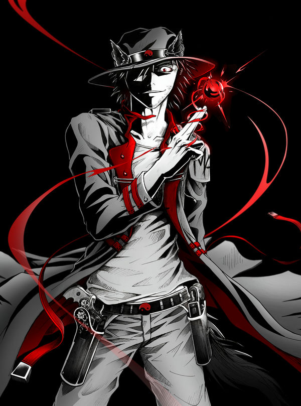
On a technical standpoint the image is executed very nicely. Attention to detail is admirable. The small details aren't distracting, and are only noticeable when you start looking at the picture more carefully.
The red color works well and the orb helps to keep the attention on the characters face and hand which are, in my opinion, the most important parts in the picture. In terms of shading the face and the hand also stand out well compared to the lower half of the body.
The character's position, flowing jacket and the red beams make the composition very dynamic.
One thing that caught my attention though, was that the perspective is a little off. The angle and the size of left-hand gun make it seem like it's much farther to the back than the right-handed gun, but the position of the hips suggest that they're almost at the same level (sorry if that doesn't make any sense, English isn't my native language). So now it looks like the left-handed gun is somewhat smaller than the right-handed gun. Then again, looking at the guns they seem to be a little different, so maybe the other one is supposed to be smaller?
As a cover this image would work very well. It's well balanced and just by looking at the character, his expression and body language, the reader can immediately get an idea what type of a person he is. Overall great work!