ShopDreamUp AI ArtDreamUp
Deviation Actions
Comic creation support
Support my comic creation endeavours, by supporting me with a bit every month. Every penny counts.
$1/month


Suggested Deviants


Suggested Collections


You Might Like…


Featured in Groups


Description
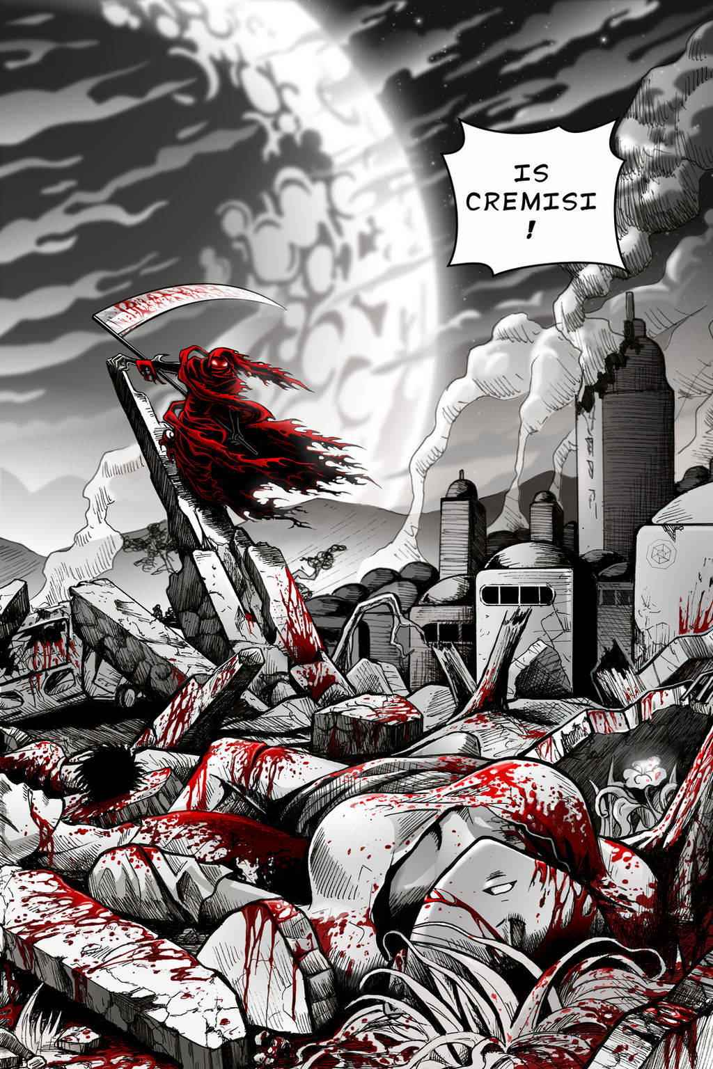
Hi! This is the FOURTH PAGE of my comic CREMISI. Artwork by me, story by Isaac Fox ")
Images drawn by hand with pencils on paper, inked, scanned and then gray-scale+crimson with GIMP.
"Cremisi is a manga-inspired space-western comic utilizing black, white, and crimson coloring to create a unique visual experience. Set in the distant future, the story follows the drunken spaceship captain Shay as he traverses the universe and uncovers the truth behind the Cremisi Incident".
To continue reading you'll need to get the full version from ComiXology But don't worry, it's only a dollar
:origin()/pre00/9d08/th/pre/i/2017/253/7/5/cremisi_page_3_by_sayakorush-d91z6px.png)
:origin()/pre00/cf5d/th/pre/i/2018/292/b/f/cremisi_page_1_by_sayakorush-d8sloxf.png)
:origin()/pre00/6bf7/th/pre/i/2017/171/a/6/cremisi_volume_1_front_cover_by_sayakorush-dbddf4r.png)
:origin()/pre00/a9ad/th/pre/i/2015/246/c/1/cremisi_page_4_textless_by_sayakorush-d9874e2.png)
:origin()/pre00/6597/th/pre/i/2017/253/1/7/cremisi_page_18_by_sayakorush-dbn0osb.png)
Images drawn by hand with pencils on paper, inked, scanned and then gray-scale+crimson with GIMP.
"Cremisi is a manga-inspired space-western comic utilizing black, white, and crimson coloring to create a unique visual experience. Set in the distant future, the story follows the drunken spaceship captain Shay as he traverses the universe and uncovers the truth behind the Cremisi Incident".
To continue reading you'll need to get the full version from ComiXology
But don't worry, it's only a dollar 

Previous page: First Page: Cover Textless version One more example Page!
Thanks for all your love and support! 
 !!!
!!!
Image size
4200x6300px 20.44 MB
© 2015 - 2024 SandraRush
Comments20
Join the community to add your comment. Already a deviant? Log In
Quite an interesting piece. The contrast of the red against the lack of colors draws the attention quickly and it makes the scene a lot more gruesome that it would simply appear without any colors, also, the character in the back is in a serious dominant, creepy pose which gives you an eeky feeling of being watched.
I like the perspective of the image, the rubble and bodies are well placed between them. Perhaps a little darker shadding might be needed for the hair and back of the clothing for the male body under the girl, as well as the squashed bus. If a certain piece is given light for a purpose, like for example the flower beside and a little backways from the girl perhaps the pieces surrounding it, rubble, tree trunk and such might need a darker shade, still, if there's no particular reason for the lighting then the area should present slightly more shadows or darkness.
Take into consideration the use of a different shading technique for the building, particularly those with conic or dome-like roofs since the semi-curvy lines do little for it. You could perhaps consider crossing lines? add sideways lines to the curvy horizontal lines so it adds to the volume and shading.
I like the coloring of the sky and "moon", they clean and constrast appropriately with the rest of the picture.
Excellent job.